U X S T R A T E G Y P R O J E C T
Partner Page Redesign
PROJECT OVERVIEW
O V E R V I E W
The Solution
Here’s an overview of the key strategies used to address these challenges and enhance the user experience:
Outdated Design and Functionality: The existing partner pages were not only visually outdated but also lacked modern web functionality. The pages were static and did not offer an engaging or dynamic user experience. Navigating and accessing information was cumbersome for users, limiting the effectiveness of the site in supporting employees of partner companies who were looking for academic opportunities. Alignment with Capella’s Updated Branding Guidelines: Capella University had recently refreshed its brand identity, and the partnership webpages did not reflect this update. Aligning the new designs with the current branding guidelines was crucial for maintaining a cohesive look and feel across the university’s digital platforms. This required thoughtful integration of color schemes, typography, logos, and messaging to ensure consistency while still allowing for partner customization. Creating a User-Centric Experience: A major challenge was the need to create a more intuitive, user-friendly experience for employees from various industries. These users required easy access to information about specific educational programs relevant to their partnership. Improving navigation, simplifying the flow of information, and ensuring that users could quickly find relevant details were key priorities to meet the needs of time-strapped working professionals. Template Flexibility for Different Partners: Each corporate partner had different academic programs available to their employees, requiring flexibility in how content was displayed. Designing templates that were customizable, yet adhered to Capella’s branding, added complexity to the project. The solution needed to accommodate a wide range of partner-specific content while maintaining consistency and usability across all partner pages. Technical Integration: The redesign also required integrating various back-end systems and tools, such as enrollment forms and external links to specific programs, without compromising the page load times or performance. Ensuring that the site was both visually engaging and technically efficient was a critical technical hurdle.
The refreshed partnership webpages will ensured a seamless user experience for employees by offering a streamlined, visually engaging, and well-organized platform.
O V E R V I E W
About the project
Capella University is an accredited online institution offering high-quality bachelor’s, master’s, specialist, doctoral, and certificate programs. It caters to adult learners seeking to advance their personal and professional growth. The university has formed strategic partnerships with companies across industries like healthcare, behavioral healthcare, corporate, and retail to provide educational opportunities for their employees at reduced costs.
The goal of this project was to modernize and redesign Capella University’s partnership webpages. These pages are vital in providing employees of partner companies with relevant information about academic programs tailored to their specific partnership. Each page offers details on the degree programs selected by the company for their employees and serves as a gateway for employees to take the next step in their educational journey.
O V E R V I E W
The Challenge
The redesign of Capella University’s partnership webpages presented several key challenges that needed to be addressed to create a modern, functional, and user-friendly experience. Below is an overview of the primary challenges encountered:
Outdated Design and Functionality:
The partner pages featured obsolete components that did not function effectively, resulting in user confusion and frustration. The lack of modern design elements reduced user engagement and detracted from the overall experience.Alignment with Capella’s Updated Branding Guidelines:
The partner pages did not reflect Capella University’s current branding standards. Outdated colors, icons, logos, and typography created inconsistencies, diminishing the professional appearance and cohesiveness of the pages.Creating a User-Centric Experience:
The existing design created a frustrating user experience, as important information was not easily accessible and the layout was confusing. A user-centered approach was essential to make the pages intuitive and easy to navigate.Template Flexibility for Different Partners:
The partner pages lacked cohesion and consistency. Each page was disorganized, and information needed to be consolidated into clear categories, allowing for better structure and a more streamlined presentation of content.Technical Integration:
The outdated system struggled with modern functionality and responsiveness. Implementing essential features, such as enrollment forms and dynamic links, while ensuring optimal performance across devices, posed a significant technical challenge.
O V E R V I E W
Tools used
I utilized a range of tools to manage the workflow and ensure a data-driven approach. Asana was key for project planning and task management, keeping the project on track. Figma was used to create wireframes and mockups, allowing me to visually design and iterate on the site's layout. I employed Adobe Target to run A/B tests, helping us refine design elements based on real user behavior. Crazy Egg and Adobe Analytics were instrumental in gathering data and optimizing the website’s performance by analyzing user interactions. Finally, Jira was used for effective communication and collaboration with the development team once the final designs were completed.
EXPLORATION
E X P L O R A T I O N
Scope of work & responsibility
Research
To understand user behaviors, needs, and motivations and to gather insights that inform the design process
UX Design
Ensure the product is easy to use & enjoyable by addressing users' needs and problems through design solutions.
UI Design
Ensures that a product’s interface is aesthetically pleasing, consistent, and easy to navigate
Prototyping
Creating a mockup to test and visualize its design, functionality, and user interactions.
WORK PROCESS
P R O C E S S
DISCOVERY
March - June
RESEARCH Competitor & User Journey
Project Timeline
DESIGN
July - October
UX User flows & Journeys
UI Design Main flow & Future concept
CONTENT Copy
TESTING MVP Flow
DELIVERY
November - March
INTERFACE Interactions & Final design
R E S E A R C H
Project goals
Consolidation
Organizing and combining the partner pages into groups
Modernization
Creating new components and modernizing the layouts
Increase conversion
Engaging the users with updated language and designs
Functionality
Making sure the page flows smoothly and easily
RESEARCH PROCESS
Informal user testing
Ran informal user tests to evaluate how users were interacting with the designs and see where I could improve
R E S E A R C H
Research objectives & goals
The research process for this project involved a combination of competitive analysis, user testing, and data-driven insights. I began by analyzing content layouts of competitors to understand best practices in structuring partnership pages and ensuring an intuitive user flow. Through this competitive analysis, I explored different approaches to meeting user needs and identifying areas for improvement in Capella’s existing pages.
Collaborating with data analysts, I designed A/B tests to evaluate different page designs, collecting and analyzing data to assess performance and identify areas for optimization. Informal user testing with colleagues and peers who were considering returning to school provided valuable feedback on how the pages felt to potential students. My goal throughout this process was to create modern, user-friendly landing pages that provide comprehensive information and facilitate an easy decision-making process for employees of Capella’s partner companies as they explore furthering their education.
Competitive analysis
Conducted a competitive analysis of key to identify gaps and opportunities and discover ways to enhance the design
A/B tests
Assisted in conducting A/B tests when new designs were created to determine which designs the users were engaging with
R E S E A R C H
Competitor analysis
The next phase of the project involved conducting a competitor analysis to guide the redesign of Capella University's partner page. I analyzed five different competitors to understand how their partner pages were structured and what elements could inform our own redesign. To organize this, I compiled a list of key questions to consider for each website:
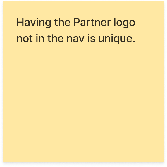
How was the layout structured? What did the hero section look like? Was a partner logo present? Did the page have a smooth user flow? Were there any unique features? How was the form experience, and overall, would a user feel frustrated at any point?
Once I had a clear set of evaluation criteria, I took screenshots of each competitor’s page and annotated them using sticky notes to highlight the pros and cons, as well as ideas for improvement. Through this process, it became evident that Capella's partner page was outdated and lacked opportunities for user interaction, as well as missing features that could drive conversions. Using these insights, I designed low-fidelity wireframes that modernized the layout and introduced a more engaging user experience for the Capella partner page.
Company
Page uniqueness
User experience
Design
R E S E A R C H
Competitor analysis findings
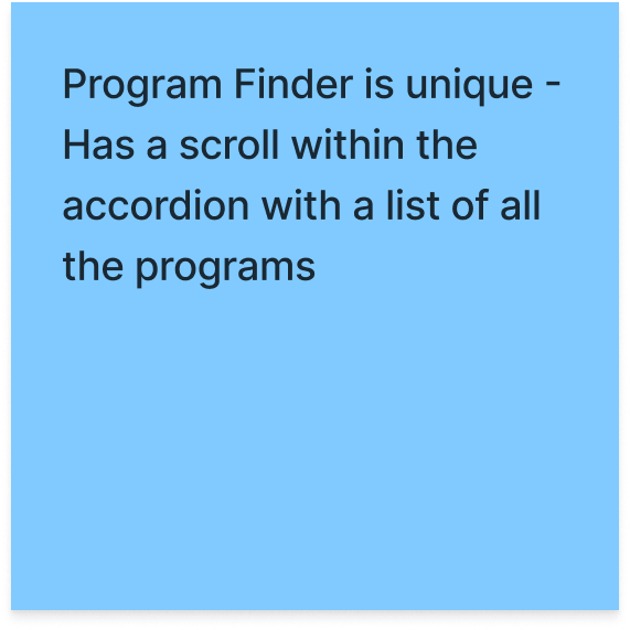
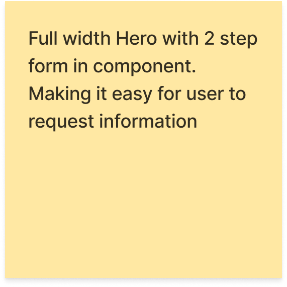
I categorized my competitive analysis findings for this project into three key areas: page uniqueness, user experience, and design. In the page uniqueness category, I looked for standout features that competitors used to enhance their partner pages. Examples included floating two-step banners that followed the user down the page, ensuring they always had access to fill out the form, and components showcasing how much a student could save.
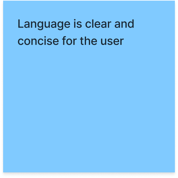
The user experience category focused on elements that improved navigation and overall ease for the user. I found that partner pages that mirrored the look and feel of the main educational site created a seamless experience. Sticky navigation also stood out, allowing users to easily return to the previous section, reducing frustration. Value proposition components that provided quick facts and benefits were also effective in keeping the user engaged.
Lastly, the design category highlighted modern, visually appealing design choices like color blocking, contemporary hero sections, infographics, and other uniquely styled components. These findings guided my approach to redesigning the Capella partner page, ensuring it would be both functional and visually engaging.
R E S E A R C H
Key metrics
20%
The projected number the e-learning market will grow by in 2030
-Source: Forbes
R E S E A R C H
User insights
87%
Of participants felt they wanted to submit a form with the new layout
54%
The percentage of students who took at least one online college course in 2022
-Source: Forbes
I conducted user surveys with respondents across the U.S. market. The goal of the survey was to gather insights into users' experiences, habits, and preferences when navigating online college partner pages. I asked questions about what they found helpful upon landing on the page, what caused frustration, and whether they found the navigation intuitive or challenging. The feedback provided crucial insights that directly informed the design process, helping me refine the layout and content to better meet user needs and improve their overall experience.
62%
Of participants who found the content on the page made sense
26%
The percentage of students who choose a fully online learning format in 2023
-Source: Forbes
71%
Of participants who would thought the overall layout of the page was improved
INFORMATION ARCHITECTURE
I N F O R M A T I O N A R C H I T E C T U R E
Ideations & sketches
In the initial sketching phase of redesigning Capella University's partner pages, I translated insights from the research phase into visual concepts. I began by creating a skeletal framework for the general structure of the templates, focusing on the core elements that would need to be present across all partner pages. Key components included the navigation bar, a hero section, an area to display available degree programs, and a user-friendly form for potential students to fill out.
Through my research, I recognized that the content on each partner page would vary significantly depending on the industry and specific partner needs, so it was essential to design components that were flexible and adaptable. My goal was to ensure that while the content might differ, the components would remain cohesive and could be used interchangeably across all partner pages, providing a seamless experience regardless of the partner type. The initial sketches laid the foundation for a generic page template that could be customized as needed while maintaining consistency across the site.
Hero section - Wanted to have the two-step banner in the hero so the user sees it right as they land on the page
Card component - Section for links to other pages, information about the university, or any content that is useful for the user
Comparison component - Section for an explanation of the learning formats for the users
Popular program section - Section to showcase the popular programs for users
Accreditation section - Adds credibility for university
Navigation - Logo, Links, CTA’s, Form
Program finder - Section where user can find a program to take
STATS banner - Component for quick facts to highlight information that users will find helpful and will increase credibility
Testimonial section - Adds credibility for university and potential new students
Free standing form - Section with a form for user to fill out to get more information
Footer
I N F O R M A T I O N A R C H I T E C T U R E
Low & mid fidelity wireframes
After completing the ideation phase for redesigning Capella's partner pages, I started creating low-fidelity wireframes. These wireframes served as a basic blueprint, outlining the placement of images, text, and buttons, as well as the overall flow of the page. The focus was on ensuring the layout was user-friendly and that the components were positioned in a way that created a logical and seamless experience for visitors. Once the low-fidelity wireframes were in place, I moved to mid-fidelity versions, adding more detail while refining the structure to align with the project’s goals.
Low fidelity wireframes
Mid fidelity wireframes
76%
Increase in conversion rate
53%
Increase in form submissions
22%
Increase in page visits
11%
Increase in button clicks
DESIGN PROCESS
D E S I G N P R O C E S S
Color palette
#253746
#94B7BB
#8A8D8F
#C10016
#D9D9D6
#D3BC8D
#FFFFFF
#212322
COMPLETED PROJECT
K E Y T A K E A W A Y S
Final Designs
The redesign of Capella University’s partner pages yielded significant improvements in both user experience and performance outcomes. Key takeaways from the project include a refined design that enhanced the flow and layout of the pages, making it easier for users to navigate and access relevant information. This resulted in a more intuitive and engaging experience for employees of partner companies.
The redesign also focused on modernizing components and design elements while ensuring alignment with Capella’s branding guidelines. This created a cohesive and visually appealing platform that reinforced Capella’s professional image across all partnership pages. Additionally, the introduction of flexible, customizable templates enabled Capella to easily onboard new partners without the need for extensive design changes, supporting long-term growth with a streamlined process for future updates.
Throughout the project, I gained a deeper understanding of UX strategy, particularly in balancing user needs with business objectives to deliver impactful design solutions. The redesign significantly improved site performance, with conversion rates increasing by 56%, page views by 43%, and form submissions by 67%. These metrics underscore the success of the redesign in driving user engagement and achieving measurable results.
Overall, this project highlighted the critical role of user-centered design in creating scalable, effective digital solutions that deliver meaningful business outcomes.


