U S E R I N T E R F A C E
SAVINGS CACULATOR
PROJECT OVERVIEW
O V E R V I E W
The Solution
The solutions implemented in creating the savings calculator focused on simplifying the user interface and streamlining the user experience. A clean, straightforward design with only a few essential input fields kept users engaged, reducing frustration and making the tool more accessible. Ensuring that users could quickly input their information and receive instant results addressed both usability and accessibility challenges, enhancing the overall experience.
Through research and informal testing, the ideal placement for the tool was identified—the pricing page—where users could easily discover their savings and make informed decisions about which plan to choose. Ultimately, by providing instant savings results, the calculator successfully increased conversion rates and subscriptions.
Developing the savings calculator came with several hurdles, primarily related to simplifying user experience, optimizing functionality, and deciding on tool placement.
Streamlining Functionality: One of the main challenges was refining the functionality to create a smooth and intuitive user flow. The previous tool had too many steps, leading to user frustration and drop-offs. The goal was to eliminate unnecessary steps, ensuring users could instantly and easily view their savings without confusion or delays.
Instant Results and Efficiency: A significant challenge was designing the calculator to deliver immediate results. Unlike traditional tools that might require multiple inputs or page transitions, this tool needed to provide results instantly while minimizing user effort. Balancing accuracy with speed was essential to maintain user trust in the results without overwhelming them with complexity.
Visibility and Accessibility: Ensuring that all input fields and relevant information were visible upfront was a key design challenge. The previous version buried fields behind extra clicks or steps, making it hard for users to navigate. This new version had to make all fields accessible in a single component, enhancing clarity and reducing friction in the user journey.
Page Retention: Another obstacle was ensuring the user could interact with the tool without being redirected or taken off the page. Keeping users on the same page provided a more fluid experience, avoiding page reloads or additional navigation steps that could increase the risk of abandonment.
Tool Placement: Deciding where the savings calculator would live on the site posed a strategic challenge. It had to be placed in a location where it would naturally attract attention, but not disrupt the overall site design or other user interactions. Balancing visibility, usability, and site navigation was crucial to its effectiveness.
The project required thoughtful consideration of user experience, technical constraints, and design placement. Addressing these challenges successfully meant delivering a faster, more accessible, and friction-free tool that would ultimately increase user engagement and conversion rates for Sophia.
O V E R V I E W
About the project
The goal of this project was to design and develop a user-friendly savings calculator for an online college, Sophia, to help prospective students estimate their potential savings. By entering the number of courses they plan to take with Sophia, users receive an estimated dollar amount in tuition savings compared to traditional college or university courses.
Features:
User Input: Users can input the number of courses they are interested in taking through Sophia.
Cost Comparison: The tool calculates and displays the tuition savings compared to traditional institutions.
Clear Value Proposition: The savings amount is highlighted to underscore the affordability of Sophia courses.
Account Creation: After receiving the savings estimate, users are prompted to create an account to access more details and begin enrollment.
The primary objective was to increase the conversion rate of site visits by encouraging users to create accounts with Sophia. The savings calculator was designed to serve as a compelling tool for prospective students to easily understand the financial benefits of choosing Sophia courses, driving them to sign up and explore further educational opportunities.
O V E R V I E W
The Challenge
O V E R V I E W
Tools used
For the savings calculator project, I used Figma to ideate, design, and create wireframes and mockups, ensuring a clean and intuitive user interface. Photoshop was utilized for image editing, enhancing the visual elements of the tool. For project planning and management, Asana helped organize tasks, track progress, and maintain timelines. Additionally, Jira was employed for effective collaboration and communication with developers, ensuring that design and functionality aligned seamlessly throughout the project’s development. These tools together facilitated smooth execution from concept to completion.
EXPLORATION
E X P L O R A T I O N
Scope of work & responsibility
Research
To understand user behaviors, needs, and motivations and to gather insights that inform the design process
UX Design
Ensure the product is easy to use & enjoyable by addressing users' needs and problems through design solutions.
UI Design
Ensures that a product’s interface is aesthetically pleasing, consistent, and easy to navigate
Prototyping
Creating a mockup to test and visualize its design, functionality, and user interactions.
WORK PROCESS
P R O C E S S
DISCOVERY
November - December
RESEARCH Competitor analysis & Ideations
Project Timeline
DESIGN
January - February
UI Design Main flow & Future concept
DELIVERY
March - April
INTERFACE Interactions & Final design
RESEARCH PROCESS
R E S E A R C H
Competitor analysis
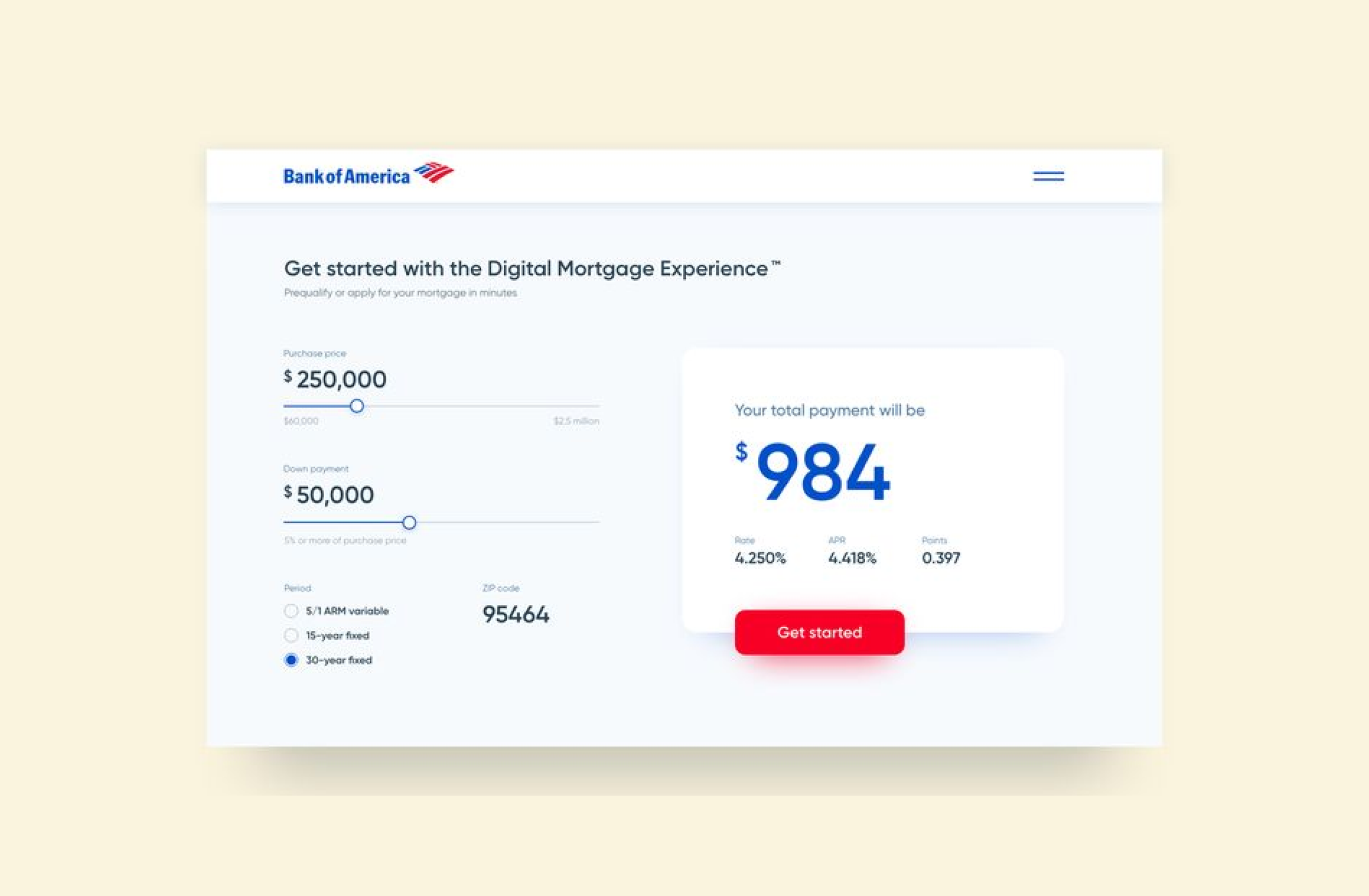
For the competitor analysis phase of the savings calculator project, I reviewed four different companies to gain insights into what worked well in their tools and how we could differentiate ours. The first company I analyzed was Bank of America, whose calculator had a visual style I admired. It featured large, easily visible results, simple input fields, and a prominent call-to-action button, all contributing to a great user experience. However, I found that the inputs could potentially confuse users, which highlighted the importance of simplifying the input process. Next, I evaluated Fidelity Investments, which used a mix of sliders and input fields to engage users. While this approach added interactivity, the overall user interface was overly busy, making the experience feel overwhelming and frustrating.
I also looked into Virginia529’s savings calculator, which stood out for its straightforwardness and ease of use. However, its design felt outdated and needed modernization to enhance user appeal. Lastly, I analyzed NerdWallet, where one standout feature was the graph that displayed savings trends after users entered their information. While this visual representation was a strong point, the downside was the excessive number of input fields, which risked user fatigue. After reviewing all these competitors, I realized that for Sophia, I wanted the calculator to have a modern, clean design that made users feel comfortable and engaged without being overwhelmed. It needed to deliver results quickly and include a feature, such as a visual element, to keep users intrigued while simplifying the overall input process to avoid frustration.
Bank of America
Virginia529
Fidelity Investments
NerdWallet
INFORMATION ARCHITECTURE
I N F O R M A T I O N A R C H I T E C T U R E
Ideation & sketch
After completing the competitor analysis, I began ideation sketches to shape the overall look and functionality of the savings calculator. My primary goal was to keep the user experience simple and efficient by minimizing the number of input fields. I envisioned a split-screen layout, with input fields on the left and results displayed on the right, ensuring users had everything in one view for convenience. During the sketching process, I realized that only two input fields were necessary, so I opted for sliders instead of manual inputs to streamline the experience and reduce the potential for user errors. This approach ensured a fast, intuitive interaction for the user while maintaining clarity and ease of use.
I N F O R M A T I O N A R C H I T E C T U R E
Low fidelity wireframe
After finalizing the sketches, I transformed them into low-fidelity wireframes and presented them to the product manager. One challenge raised during this phase was the need to incorporate legal copy directly within the calculator component. Initially, I had placed the legal text below the component, but the product manager requested that it be more visible within the tool itself. To address this, I explored various layout options and ultimately decided to position the legal copy alongside the results, beneath the call-to-action button. This placement ensured that users could see all relevant information, including legal disclaimers, before proceeding to sign up, keeping the layout clean while meeting legal requirements.
I N F O R M A T I O N A R C H I T E C T U R E
Mid fidelity wireframe
After receiving approval on the low-fidelity wireframes, we presented them to the developers to assess the project’s feasibility and determine the number of sprints required. Once we received confirmation from the development team, I proceeded to create mid-fidelity wireframes, where the calculator’s design began to take shape. These wireframes allowed us to refine the placement of key elements such as input fields, the call-to-action button, and the legal copy, ensuring that the layout was intuitive and cohesive. By focusing on the overall flow and usability, I was able to confirm that all elements worked harmoniously within the tool. After reviewing and approving the mid-fidelity wireframes, I moved on to developing the high-fidelity version, which was then handed off to the developers for implementation.
I N F O R M A T I O N A R C H I T E C T U R E
Heat map
After developing the mid-fidelity wireframes, I conducted usability testing with a small group of users to evaluate their interaction with the calculator. Utilizing Crazy Egg, I performed a heat map analysis to identify user engagement patterns and ensure the interface was intuitive before finalizing the designs. The primary objective was to determine whether users were interacting with the correct elements—particularly the sliders—and to assess the effectiveness of the call-to-action (CTA) button post-calculation. I wanted to confirm there was no user confusion and that the intended user flow was seamless.
The results indicated that users interacted with the sliders as anticipated and clicked the CTA button as expected. However, an unexpected interaction occurred with the static image, leading me to consider replacing it with a GIF to reduce confusion. Overall, the test confirmed that the design functioned as intended, with minimal adjustments needed for the final iteration.
26%
Increase in subscriptions
31%
Increase in conversion rates
56%
Increase in page visits
DESIGN PROCESS
D E S I G N P R O C E S S
Color palette
#250E62
#D0DF00
#FFFFFF
#00000
USER FLOW & PROTOTYPE
P R O T O T Y P E
Final prototype
Click the image to preview the prototype
COMPLETED PROJECT
K E Y T A K E A W A Y S
Final Designs
The development of a savings calculator for Sophia resulted in several key improvements in functionality, user engagement, and overall site performance. The main takeaways from this project include: Enhanced User Experience with Modern Design: The calculator was built to provide a modern, user-friendly interface, designed to deliver instant, clear results. This feature not only improved accessibility but also kept users engaged by allowing them to quickly visualize their potential savings, contributing to a more interactive and dynamic experience on the site. Significant Increases in Conversion Rates and Subscriptions: Following the launch of the savings calculator, Sophia saw a 31% increase in conversion rates and a 26% increase in subscriptions. The tool’s interactive and informative nature played a critical role in capturing user interest and driving these performance gains. Building from the Ground Up: This project involved developing the calculator from scratch, leveraging research and innovative design elements to create a tool that was both unique and effective. The process provided valuable insights into UX design and functionality, ensuring the tool met user needs while aligning with Sophia’s goals. Overall, the savings calculator added a dynamic and engaging feature to the Sophia platform, significantly improving user engagement and driving measurable business outcomes.


