A I R L I N E A P P
Passenger Mobile App
PROJECT OVERVIEW
O V E R V I E W
The Solution
Several innovative solutions were found to overcome the challenges faced during the app’s development.
Functionality and User Experience: The team employed in-depth user research and usability testing to design a minimalistic yet functional app that offers easy navigation and quick access to key travel information.
Integration of Multiple Airlines: Establishing strong API integration with multiple airlines and building a robust back-end system allowed for smooth data flow. The system was designed to adapt to various airline platforms, ensuring that users could access real-time information across different carriers.
Seamless Dashboard Design: A well-structured UX strategy was implemented to design a dashboard that presents essential travel information in a clear and concise manner. The design focused on prioritizing frequently used features while allowing for easy access to secondary information.
Balancing Unique Design and Functionality:The team crafted a design that was visually distinct yet grounded in usability principles. By focusing on user needs and leveraging feedback, the app strikes a balance between aesthetic appeal and easy, efficient navigation.
Data Security and Privacy: A strong focus on security was implemented by using advanced encryption techniques and strict privacy protocols, ensuring that user data remained secure across all platforms.
The development of the Passenger app presented a number of complex challenges, particularly around functionality, airline integration, and user experience. However, through iterative design processes, technical problem-solving, and a user-centered approach, Passenger successfully addresses these challenges, offering travelers a unified platform for managing their flights, boarding passes, and loyalty programs across multiple airlines.
Several key challenges arose during the development and design of this app.
Functionality and User Experience
Balancing complex functionality with an intuitive user experience was a major challenge. The app needed to offer a range of features—tracking flights, storing boarding passes, and monitoring loyalty points—while keeping the user interface simple and streamlined.Integration of Multiple Airlines
Airlines use different APIs and systems, making integration into a single app a significant technical hurdle. Each airline has its own way of managing flight data, boarding passes, and loyalty programs, which complicated the process of consolidating them into one platform.Seamless Dashboard Design
Creating a dashboard that combines data from multiple sources without cluttering the interface posed a design challenge. Users needed access to vital information—like flight updates and boarding passes—at a glance while still maintaining a clean and organized layout.Balancing Unique Design and Functionality
The app had to stand out in a crowded travel app market while ensuring a highly functional and user-friendly design. Finding a balance between a visually appealing app and one that’s practical for frequent travelers was a major challenge.Data Security and Privacy
Given the sensitive nature of flight and personal information, ensuring data security was a crucial concern. The app needed to protect users’ personal and flight data while adhering to privacy regulations.
O V E R V I E W
About the project
Passenger is designed to address the common frustration travelers face when juggling multiple airline apps. The goal is to create a seamless, user-friendly mobile application that consolidates all flight information, boarding passes, and loyalty points from various airlines, including Southwest, Delta, and others, into one convenient location. This eliminates the need to switch between different airline apps, providing users with a streamlined travel experience from booking to boarding.
The target audience for Passenger are frequent flyers, business travelers, and casual travelers who often fly with different airlines and seek a more efficient way to manage their flights and travel-related information.
Passenger will be the go-to app for travelers who value convenience and simplicity, offering a one-stop solution for managing all flight-related information and loyalty rewards across airlines, something not currently available in any single app. By simplifying the flying experience and reducing the need to juggle between apps, Passenger aims to become an essential tool for modern travelers.
O V E R V I E W
The Challenge
O V E R V I E W
Tools used
The tools utilized in the development of the app's user interface included Figma for designing low, mid, and high-fidelity wireframes, ensuring a comprehensive visual and interactive representation of the app's layout and functionality. Photoshop was employed to create high-quality mockups and edit images, refining the app's visual elements. Additionally, Quip was used for documenting ideas, capturing notes, and facilitating collaboration throughout the design process.
EXPLORATION
E X P L O R A T I O N
Scope of work & responsibility
Research
To understand user behaviors, needs, and motivations and to gather insights that inform the design process
UX Design
Ensure the product is easy to use & enjoyable by addressing users' needs and problems through design solutions.
UI Design
Ensures that a product’s interface is aesthetically pleasing, consistent, and easy to navigate
Prototyping
Creating a mockup to test and visualize its design, functionality, and user interactions.
WORK PROCESS
P R O C E S S
DISCOVERY
February - March
RESEARCH Competitor & User Journey
Project Timeline
DESIGN
April - June
UI Design Main flow & Future concept
DELIVERY
July - September
INTERFACE Interactions & Final design
RESEARCH PROCESS
R E S E A R C H
Hopper App has a Straight to the point hero. Hopper gives the user tons of options and the flow is seamless
American Airlines app gives the user an easy experience. They are able to find what they need right away. Navigation makes everything smooth
Competitor analysis
The next phase of the project involved conducting a comprehensive competitive analysis. For this, I researched six different travel apps to gain insights into their overall look and feel, content layout, user flow, and key design features. The objective was to understand how these apps were structured and how they addressed user needs. Key questions guided the analysis, such as: What is the overall user experience? What services are offered? Is the user journey intuitive and simple? Who are the competitors' customers? What do users appreciate or criticize about the competitors' products? What essential features are incorporated? By carefully examining each app, I was able to gather valuable insights to inform and refine the design of the Passenger app.
CityMapper app has Some pros including of nice icons, colors, user flow is nice
Tripit has a great description right when the user lands on the page. The navigation is great as well
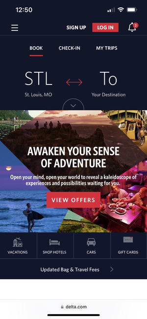
Delta Airlines has great features. Right when you land on the homepage you are able to book a trip
Southwest App is straight to the point. The user wouldn’t get confused or frustrated
R E S E A R C H
Key metrics
I researched some key insights and stats about flight booking apps to get a better idea of how users would interact with the Passenger app.
76%
Percentage of all travel revenue is projected to come from online bookings by 2028.
-Source: Research gate
61%
The number of flight bookings coming from a mobile app versus online.
-Source: Research gate
80%
Percentage of travelers worldwide prefer to book their entire trip online.
-Source: Research gate
INFORMATION ARCHITECTURE
I N F O R M A T I O N A R C H I T E C T U R E
User Journey Map
I created a user journey map to outline the steps a user takes when interacting with the Passenger flight booking app, from initial app launch to completing a purchase. This map visualizes the user's experience at each stage, including browsing flights, selecting preferences, reviewing options, and finalizing the booking. It highlights key touchpoints, potential pain points, and opportunities to enhance the user experience, ensuring a seamless and intuitive process from start to finish.
I N F O R M A T I O N A R C H I T E C T U R E
Low Fidelity Wireframes
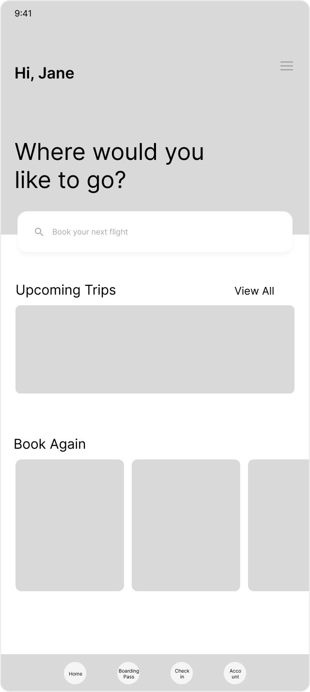
In the next phase of the project, I focused on creating initial sketches and low-fidelity wireframes for the Passenger flight booking app. My primary goal was to ensure the user flow across screens was intuitive and efficient. During this process, I mapped out the placement of buttons, considered which components to develop, and identified the key design elements to incorporate. These low-fidelity wireframes served as a blueprint for refining the app’s structure and guiding the design toward a user-centered experience.
Mid Fidelity Wireframes
I N F O R M A T I O N A R C H I T E C T U R E
Mid fidelity wireframes to and user flow
I N F O R M A T I O N A R C H I T E C T U R E
Heat mapping
To ensure the app’s flow was intuitive for users, I tested the mid-fidelity wireframes by asking a few users targeted questions, such as, "If you were trying to book a flight, where would you go?" In addition to gathering feedback through questions, I analyzed where users interacted most with the interface. This combination of direct inquiry and behavioral analysis helped me determine whether the user flow aligned with my intended design.
95%
Increase in flight demands
76%
Travelers prefer travel apps
17%
People use travel apps to save on trips
DESIGN PROCESS
D E S I G N P R O C E S S
Color palette
Primary
Secondary
#003CBE
Inter Bold
40px - 50px Headings
#86C1F1
#7B7B7B
#FFFFFF
#000000
Aa
D E S I G N P R O C E S S
Fonts & typography
Inter font family
Inter Semibold
32px - 36px Headings
#EEEEEE
Inter Medium
24px - 30px Body text
#B9B9B9
Inter Regular
16px - 18px Body text
UI COMPONENTS
D E S I G N P R O C E S S
Component Library
The process of building the component library for the Passenger Airline App was designed to be both efficient and user-focused. Key priorities included creating components that were intuitive for users while ensuring the overall interface was visually distinct and aesthetically pleasing. Emphasis was placed on small but impactful details, such as maintaining a consistent color palette and strategically placing icons to enhance usability and tell visual stories. Every design choice was made with the user in mind, ensuring that the interface was not only functional but also visually engaging and easy to navigate.
USER FLOW & PROTOTYPE
P R O T O T Y P E
Final prototype
COMPLETED PROJECT
K E Y T A K E A W A Y S
Final Designs
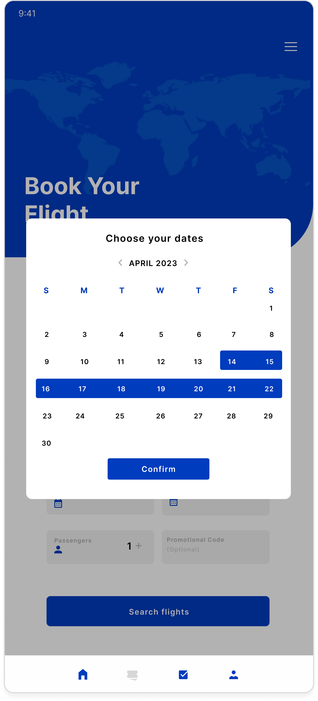
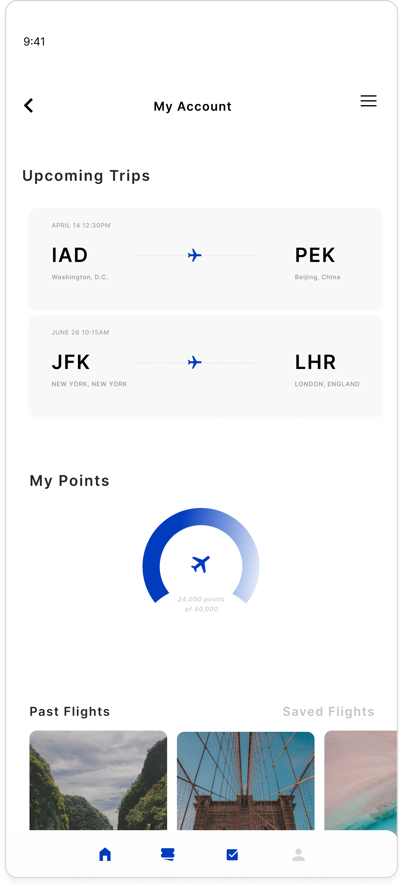
The final phase focusing on creating high-fidelity wireframes. Through this process, I refined my design skills and ensured that the app was user-centered, visually appealing, and easy to navigate. Key design principles such as shadow placement, creating a cohesive color palette, and choosing the right imagery and icons were integral in crafting an interface that told a clear story to users. I also learned how to incorporate accessibility guidelines, making the app functional for all users, including those with disabilities. My main goal was to deliver an app that seamlessly guided users through the booking process, while also being aesthetically pleasing. The experience taught me valuable lessons in balancing design and functionality, resulting in a polished, user-friendly final product.
The key takeaways were gained a deeper understanding of shadow placement, color palettes, and selecting imagery and icons to create an engaging, cohesive user experience. Another takeaway was accessibility considerations — applied accessibility best practices, ensuring the app was inclusive and usable by a diverse range of users. The next takeaway was user-centered functionality which focused on ensuring the app was intuitive and easy to navigate, optimizing user flow for a smooth booking experience. The final takeaway was aesthetic and usability balance. This meant ahieving a balance between visual appeal and practical usability, ensuring the app was not only beautiful but also functional for everyday use. This project was a valuable learning experience, solidifying my skills in UI/UX design and accessibility.


